
Tariffs, Trust, and Tightening: The Invisible Forces Moving Markets
Why the Fed is stuck, what the job market’s whispering, and how your savings could quietly shrink.

Tariffs have forced the Fed to sit tight, here’s how the policy freeze could sway your mortgage, portfolio, and next home purchase.
Key Takeaways
Chart of the Week - The labor market is cooling, not collapsing, with job openings and unemployment both below average, signaling softer hiring demand that could ease wage-driven inflation and shift the Fed’s stance.
Beyond Bias - Thinking everyone agrees with you isn’t just a bias, it’s a blind spot that can leave you overconfident, underprepared, and dangerously exposed when markets move the other way.
Building Wealth - Your relationships aren’t just support, they’re strategy, compounding like capital to open doors, build resilience, and shape your financial future in ways money alone can’t.
Historical Perspective - From 1945 to 1980, the U.S. quietly shrank its massive debt by letting inflation silently erode savings, offering a warning to today’s investors about the hidden cost of low bond yields and negative real rates.
Literature Review - A small set of stocks drive most of the gains in factor investing, meaning DIY investors may do better focusing on overlap than chasing dozens of strategies.
Chart of the Week:
The two data series in this chart—the U.S. unemployment rate and total nonfarm job openings—are foundational indicators of labor market health. Because they are measured in different units and on vastly different scales (unemployment is a percentage, typically between 3–10%, while job openings are raw counts in the millions), both series have been standardized to enable meaningful comparison. Standardization adjusts each series to have a mean of zero and a standard deviation of one, rescaling them without altering their underlying trends or relationships. This allows us to visually assess how the two variables move together over time and detect shifts in labor market tightness.
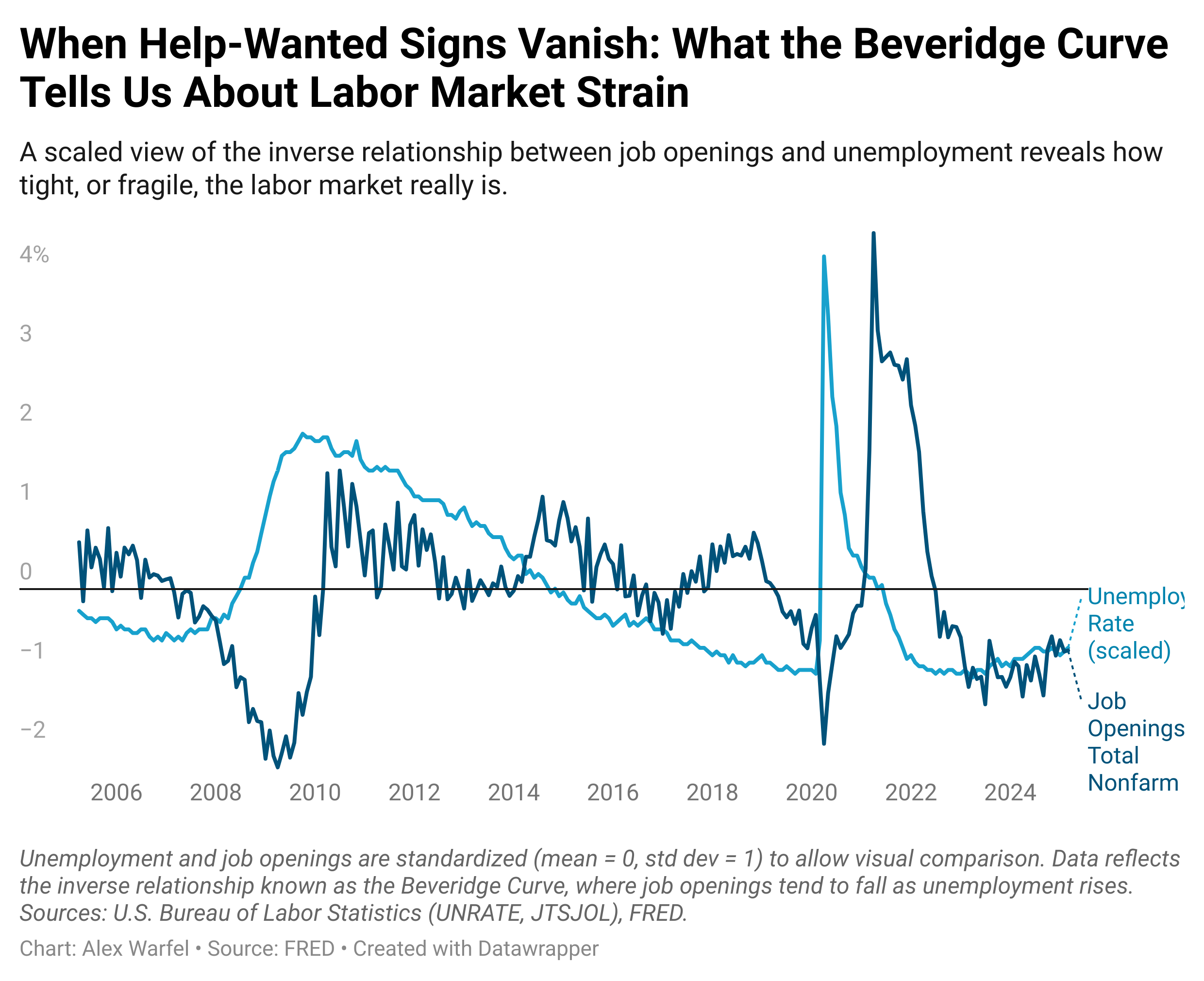
As of March 2025, both scaled unemployment (–0.744) and job openings (–0.777) sit below their historical averages, suggesting a labor market that is softening but not yet stressed. This position on the Beveridge Curve—low unemployment coupled with declining openings—signals that while layoffs remain limited, employers are slowing down their hiring, reversing the overheated dynamics of 2021–2022 when job openings surged amid labor shortages. That earlier period pushed the curve outward, reflecting market mismatches and hiring frictions. Today’s inward drift reflects normalization, but also growing employer caution. For investors, this is a subtle yet important shift: weakening demand for labor often precedes slower wage growth and household consumption, key drivers of economic momentum. The Fed watches this closely as a proxy for slack, and so should markets—it may be the clearest signal yet that labor-driven inflation pressure is fading.
Beyond Bias: False Consensus - When You Mistake Agreement for Accuracy
The false consensus effect is a cognitive bias where individuals overestimate how widely their beliefs, preferences, and behaviors are shared by others. First identified by Ross, Greene, and House (1977), this phenomenon distorts how we interpret consensus, leading us to believe our views are more common and objectively correct than they actually are. In financial contexts, this bias fuels misplaced confidence: bullish investors assume “everyone sees the upside,” while bears feel validated by their echo chambers. Research by Marks and Miller (1987) found that individuals with high confidence in their beliefs showed an even stronger false consensus effect, reinforcing the idea that conviction often substitutes for evidence. In markets, where diversity of opinion is what creates price movement, assuming that others think like you can be especially dangerous. It leads investors to ignore contrarian signals, dismiss dissenting views, or stay overweight in assets long after the crowd has moved on.
To counter the false consensus effect, investors need to actively seek out dissent, and treat disagreement not as a threat, but as data. One powerful approach is considering the opposite, a technique highlighted in research by Lord, Lepper, and Preston (1984), which found that deliberately generating counterarguments reduces biased assimilation and strengthens judgment quality. Portfolio reviews should include a formal “disagreement checkpoint”: ask, What would I need to see to change my view? or Why might a smart person take the opposite side? Participating in diverse forums, reading across ideological lines, and exposing yourself to performance data that contradicts your assumptions can all help deflate the illusion of consensus. In investing, as in life, the scariest position to be in isn’t being wrong, it’s thinking you’re right and assuming everyone else agrees.
Building Wealth: Social Capital as Leverage - The Hidden Asset Behind Opportunity
Social capital, your network of relationships, trust, and shared norms, is often dismissed as a soft skill. But research shows it functions more like high-leverage capital, capable of unlocking career opportunities, financial resilience, and psychological well-being. Unlike financial capital, which compounds through market returns, social capital compounds through reciprocity and reputation. Sociologist Mark Granovetter’s seminal work, The Strength of Weak Ties (1973), found that people are more likely to find job opportunities through acquaintances than close friends, because weak ties expose us to novel information and non-redundant connections. More recently, Raj Chetty’s Social Capital Atlas (2022) found that upward income mobility correlates most strongly with cross-class friendships, what he calls “economic connectedness”, even more than school quality or neighborhood income. In other words, who you know, and who they know, can directly impact your financial trajectory.
Building social capital is less about transactional networking and more about consistent, authentic participation in meaningful communities. That could mean joining a professional Slack group, hosting a quarterly dinner, or volunteering in a way that lets others see your reliability and values. Research from Putnam’s Bowling Alone (2000) emphasizes that high-trust societies and organizations tend to have stronger economic outcomes because trust reduces friction in cooperation and decision-making. Practically, this means being generous with introductions, following through on small commitments, and offering expertise without immediate return. As with any form of capital, compounding takes time, but over years, a reputation for reliability and generosity can yield asymmetric upside in the form of job offers, referrals, collaborations, and resilience during downturns. In a world where algorithms and institutions increasingly gatekeep opportunity, social capital remains one of the few assets that you can grow organically, and deploy exponentially.
Add to your Toolbelt
Take control of your financial future with Rainier FM, your AI-powered financial planning companion. FM stands for Financial Model, and that’s exactly what this app delivers: optimized, data-driven financial plans tailored to your goals. Using advanced optimization techniques and AI-driven insights, Rainier FM helps users navigate everything from retirement planning to wealth building with confidence. Pricing reflects the cost of running the service, but I’m actively gathering feedback to refine and improve it. Here’s an example of an insight this app can help you uncover.

If this sounds like something you’d find valuable, feel free to reach out or sign up, I’d love to hear what you think as I continue developing the platform!
Historical Perspective: The Financial Repression Era - When Debt Got Inflated Away
In the wake of World War II, the United States found itself with government debt exceeding 119% of GDP, an unprecedented burden at the time. But rather than pursue austerity or default, policymakers quietly engineered a long-term debt workout by manipulating the real returns savers received. This strategy, known as financial repression, relied on keeping interest rates artificially low, maintaining capital controls to trap domestic savings, and allowing inflation to erode the real value of government liabilities. From 1945 through the early 1980s, this approach enabled the U.S. to shrink its debt-to-GDP ratio by nearly two-thirds, even as it ran primary budget deficits through much of the period (Reinhart & Sbrancia, 2011).
At the heart of this strategy was the capping of nominal interest rates. The Fed, via the 1942 Treasury-Fed Accord, had promised to peg short-term rates at 0.375% and long-term bond yields at 2.5%, a policy that remained in place until 1951. During the 1940s and 1950s, inflation averaged nearly 4%, meaning bondholders consistently earned negative real returns. In effect, savers were taxed in a way that never showed up in legislation or headlines. Between 1945 and 1980, the average annual real return on Treasury bills was –0.3%, and for long-term government bonds it was just 1.2%, well below equity or commodity returns (Siegel, 2014).
This repression wasn’t limited to the U.S. Capital controls ensured domestic investors couldn’t easily seek higher yields abroad. Bank regulation (e.g., Regulation Q) limited the interest paid on deposits, pushing savers into low-yielding government bonds. Pension funds and insurance companies were nudged or required to hold large allocations of government debt. The result was a captured investor base funding public obligations at below-market rates. Inflation, meanwhile, was tolerated, and sometimes encouraged. Between 1945 and 1980, the U.S. had 13 years where inflation exceeded 5%, further accelerating the erosion of debt burdens in real terms.
The parallels to today’s macro environment are striking. Public debt has once again surpassed 100% of GDP. Central banks have used QE to absorb government bond issuance, suppress yields, and stabilize markets. Real rates remain deeply negative, and fiscal authorities appear willing to tolerate elevated inflation so long as it supports nominal growth. For long-term investors, this historical precedent raises uncomfortable questions: Are your savings once again being used to solve someone else’s debt problem?
Understanding financial repression matters because it reshapes the risk-reward profile of asset classes. In such an environment, nominal returns on bonds may look stable, but their real purchasing power erodes silently. Investors seeking protection must think more like the postwar generation that turned to real estate, equities, and scarce assets like gold, not because they chased yield, but because they recognized that government debt wasn’t a store of value. The past, once again, may be prologue.
Works Cited
Reinhart, C. M., & Sbrancia, M. B. (2011). The Liquidation of Government Debt. NBER Working Paper No. 16893. https://www.nber.org/papers/w16893
Siegel, J. J. (2014). Stocks for the Long Run (5th ed.). McGraw-Hill.
U.S. Bureau of Labor Statistics. Historical CPI data. https://www.bls.gov/cpi
U.S. Federal Reserve. (1951). Accord between the Treasury and Federal Reserve.
Eichengreen, B. (2008). Globalizing Capital: A History of the International Monetary System. Princeton University Press.
Literature Review: The Overlap Illusion – Why Most Factor Investing Gains Come from a Few Stocks
A new working paper by Alexander Y. Chen (2025) quietly upends decades of assumptions in factor investing by asking a simple but overlooked question: what if the same handful of stocks are driving all the outperformance across seemingly different anomalies? Using data from 1926 to 2023 and 164 published anomalies, Chen finds that the vast majority of alpha, a measure of risk-adjusted return, can be traced back to a small overlapping subset of stocks that appear repeatedly in long or short legs of anomaly portfolios. These “overlap stocks” may explain why factor investing often works in backtests, why it fails in practice, and how investors could simplify their portfolios without sacrificing performance.
Chen’s key insight is that a small group of stocks show up across many different anomaly strategies (e.g., value, momentum, profitability), and these overlap stocks deliver disproportionately strong returns. For example, just 10% of stocks each month are responsible for nearly 80% of the cumulative returns across all anomaly portfolios. The study constructs a simple portfolio consisting only of these “top overlap” stocks and finds that it outperforms most individual anomalies, by a wide margin. A value-weighted version of the 90th percentile overlap portfolio generates a Sharpe ratio of 0.65, more than 50% higher than the average unfiltered anomaly. Sharpe ratio, for context, measures return per unit of risk, so a higher value indicates a better risk-reward tradeoff.
Crucially, Chen shows that excluding these overlap stocks from traditional anomaly portfolios causes performance to collapse. Filtering out just the top 10% of overlap stocks cuts average alpha in half. Even for categories like momentum and profitability, widely seen as robust, removing the overlap stocks slashes abnormal returns by 40–80%. This finding holds across decades and across different weighting schemes. For DIY investors or fund managers chasing factors, the implications are sobering: most factor premiums appear to rely on a small, shared set of stocks, not a broad or diversified cross-section. This helps explain why so many factor ETFs underperform, if they fail to capture the key overlap names, they miss the alpha.
What causes these overlap stocks to outperform? Chen finds compelling evidence that investor mispricing plays a central role. Analysts tend to be overly optimistic about short-leg stocks (those expected to underperform) and overly pessimistic about long-leg stocks. This results in large forecast errors, stocks most heavily shorted by anomaly strategies are predicted to return 47% but actually earn only 12%, while top long-leg stocks are forecast to return 28% but deliver 36%. These biases mirror earlier work by Engelberg, McLean, and Pontiff (2020), who found that anomalies often reflect analyst misperceptions. In this paper, Chen links mispricing directly to anomaly overlap and shows that these biases persist through earnings announcements, further reinforcing the case for behavioral inefficiency.
For individual investors, the takeaway is surprisingly hopeful. Rather than trying to replicate dozens of academic strategies or guess which factor ETF will outperform, it may be more effective to identify the small subset of stocks that are repeatedly flagged by different signals. The paper doesn’t offer a ready-made list, but the principle is clear: overlap matters more than category. Investors should also beware of filtering out stocks for liquidity or cost reasons if doing so removes these high-impact names. And while the idea of mispricing may concern purists, the persistence of these errors, spanning decades, suggests that behavioral patterns may offer real, repeatable opportunities. In a world overflowing with smart-beta products, Chen’s paper offers a refreshing reminder: sometimes, simpler and more concentrated portfolios deliver better results, not because they’re complex, but because they’re focused on where the real action is.
Curious about money, investing, or the economy?
I occasionally answer reader questions in the newsletter, no jargon, just thoughtful, practical insight. If something’s on your mind, tap the button below to send it in anonymously.