How long do tightening cycles typically last?
Walk through the data to see if expectations align with reality
Key points:
In the past, expectations for interest rates have rarely been correct.
Historical interest rate paths are available online. I conduct some simple analysis on this history which points to expected rates being higher than the past has warranted.
To request a topic anonymously, fill out this form. To reach me with questions, please email alexwarfel@gmail.com. You can also reply to this email directly.
We are currently in a tightening cycle as the Fed works to tame inflation. Investors have been questioning how long this tightening cycle will last, and the narrative over the last few months has been that rates will be higher for longer.
Yields rose above 4.97% on Thursday [10/19/2023] having settled at their highest level since July 2007 on Wednesday.
Driving longer-term yields higher is the realization that the Federal Reserve is likely to keep interest rates at high levels next year, said Altaf Kassam, a strategist at State Street Global Advisors.
This comes as r-star, a measure for the natural rate of interest when the economy is strong and inflation is stable, shows a natural interest rate between 0.57% and 1.14% depending on which model you focus on. When the fed funds rate is above this r-star value (which cannot be directly measured by the way), then the fed is constricting the economy. The higher the fed funds effective rate is above r-star, the more difficult it will be equity markets to climb because higher interest rates mean investors discount the future at a more aggressive rate.
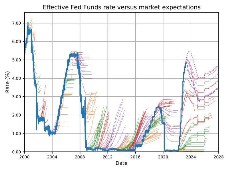
These expectations are called into question by a chart that has been making the rounds on LinkedIn lately:
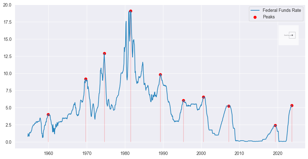
Expectations about the future seem to have been biasing towards a “higher for longer” narrative. What can our own analysis tell us about how long this tightening cycle will last? First, let’s identify past interest rate peaks.
Fed Funds Rate and peaks
I’ve identified these peaks by looking forwards and backwards at every point in time by about three years to identify the local maxima. In the event there were multiple months in a row where the rate was at peak, I just counted the first month.
Below is a heatmap showing how long it took from the peak for rates to fall 10%, 20% etc.
The above heatmap may be hard to digest, so here’s an alternative view. I calculated the mean and standard deviation for the above data. Below we see how long it typically takes in months for rates to fall with +/- one standard deviation on each side. You can see that the standard deviations get wider as time goes on which makes sense because the outcomes disperse. Note: this analysis is screaming low sample size, low statistical significance. Anytime your sample is less than 30, you should be keeping this in the back of your mind.
It’s also worth noting that the high standard deviation on each side points to a lot of dispersion in the possible paths of rates as they fell from the peak. We’ll also plot this against what the expectations for rates are over the next twelve months according to FedWatch.
Based on this analysis, using the historical projections from the past, we can see that the FedWatch estimates show expected rates are higher than what we’ve seen historically. This bolsters the argument that the market tends to predict higher rates in the future than what actually play out. This means that equity markets are likely more depressed about the future than they should be, especially with r-star rates so far below where the fed funds rate is now.


